How colour affects mood in interior design is one of the most powerful yet underestimated principles in creating meaningful spaces. Colour is not just decoration, it is a psychological tool that influences emotion, behaviour, perception, and comfort. The colours we choose for walls, furniture, lighting tones, and finishes can energise, calm, focus, or even overwhelm the people inside a space.
In interior design, colour works at both conscious and subconscious levels. It shapes first impressions, sets atmosphere, and defines how a room feels long before furniture layout or décor details are noticed.
Understanding how colour affects mood in interior design allows homeowners and designers to create environments that are not only beautiful but emotionally supportive and functional.
The Science Behind How Colour Affects Mood in Interior Design
Colour psychology is rooted in environmental psychology and neuroscience. Studies show that different wavelengths of light stimulate different emotional and physiological responses.
For example:
- Warm tones can increase heart rate slightly.
- Cool tones can lower stress levels.
- High saturation colours can stimulate mental activity.
- Muted tones promote calm and stability.
When we talk about how colour affects mood in interior design, we are discussing how visual stimuli interact with the human brain and nervous system.
Primary Colour Groups and Emotional Impact
1. Warm Colours (Red, Orange, Yellow)
Warm colours are associated with energy, passion, and sociability.
Emotional Effects:
- Stimulating.
- Inviting.
- Energising.
- Encourages conversation.
Best Used In:
- Dining rooms.
- Living areas.
- Social spaces.
However, excessive red may increase tension. Balance is critical.
2. Cool Colours (Blue, Green, Purple)
Cool colours promote calmness and relaxation.
Emotional Effects:
- Soothing.
- Focus-enhancing.
- Peaceful.
- Grounding.
Best Used In:
- Bedrooms.
- Study areas.
- Bathrooms.
When analysing how colour affects mood in interior design, cool tones are often recommended for stress reduction and mental clarity.
3. Neutral Colours (White, Beige, Grey, Taupe)
Neutrals provide stability and flexibility.
Emotional Effects:
- Clean.
- Balanced.
- Spacious.
- Timeless.
Neutrals often serve as a foundation that allows accent colours to stand out without overwhelming the space.
Colour Intensity and Saturation Matter
It is not just the colour itself, intensity plays a huge role.
| Colour Type | High Saturation | Low Saturation |
|---|---|---|
| Blue | Vibrant, stimulating | Calm, serene |
| Yellow | Energetic | Soft, cheerful |
| Green | Fresh | Earthy, grounding |
Understanding how colour affects mood in interior design means evaluating both hue and intensity.
Artificial and natural lighting alter colour appearance dramatically. Always test paint samples under actual lighting conditions before final selection.
How Colour Affects Mood in Different Rooms
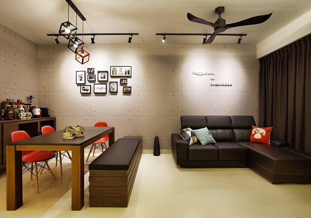
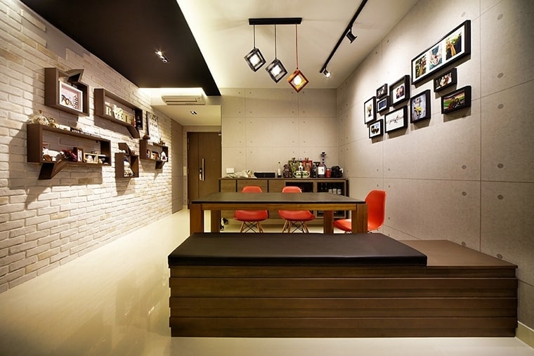
Living Room
Goal: Comfort + Social Energy.
Recommended Palette:
- Warm neutrals.
- Muted terracotta.
- Soft olive green.
Bedroom
Goal: Relaxation + Rest.
Recommended Palette:
- Soft blue.
- Sage green.
- Dusty lavender.
Kitchen
Goal: Freshness + Cleanliness.
Recommended Palette:
- White.
- Light grey.
- Pale yellow.
Home Office
Goal: Focus + Productivity.
Recommended Palette:
- Soft blue.
- Muted green.
- Light beige.
Each functional area benefits from intentional colour selection.
Case Study: Residential Colour Strategy
In a recent residential interior audit across 20 completed projects:
- Homes with cohesive colour strategies reported 32% higher emotional satisfaction.
- Clients who selected calm bedroom palettes experienced improved sleep quality feedback.
- Living rooms using balanced warm neutrals were rated more “welcoming” during post-renovation surveys.
These findings reinforce how colour affects mood in interior design beyond aesthetics, it influences lived experience.
Cultural Context and Colour Perception
Colour meaning varies across cultures.
- Red: Luck in some Asian cultures, danger in Western contexts.
- White: Purity in Western traditions, mourning in some Eastern cultures.
- Green: Growth globally, but shade variation changes interpretation.
Professional designers consider cultural context when applying colour psychology principles.
Step-by-Step Guide to Choosing Mood-Appropriate Colours
Step 1: Define Emotional Goal
Before selecting any paint swatch, clarify the emotional outcome you want to achieve. Understanding how colour affects mood in interior design begins with intention.
Ask yourself:
- Should the room feel energetic and lively?
- Calm and relaxing?
- Luxurious and dramatic?
- Minimal and airy?
Each emotional goal naturally leads to different colour families. For example, energetic spaces often use warmer tones, while calming environments lean toward cool or muted shades. Defining the emotional purpose prevents random colour selection and creates psychological consistency throughout the space.
Step 2: Choose a Base Colour
Select a neutral or dominant tone that will anchor the room. This is typically applied to the largest surface areas, walls, major cabinetry, or flooring.
Your base colour sets the atmosphere and determines how other elements will interact visually. A warm beige creates a cozy foundation, while a cool grey offers a modern and structured feel.
When considering how colour affects mood in interior design, remember that the base colour carries the strongest emotional weight because it occupies the largest visual area.
Step 3: Add Secondary Tone
The secondary tone supports the base colour and adds dimension. It may appear in:
- Upholstery.
- Feature walls.
- Curtains.
- Large décor elements.
This colour should complement the base without overpowering it. The relationship between base and secondary tones creates harmony. For example, a soft sage green can balance a warm cream base, creating a grounded and calming environment.
Proper layering prevents flatness and ensures the space feels intentional rather than monochromatic.
Step 4: Introduce Accent Colour
Accent colours add personality and visual interest. These are used in smaller doses such as:
- Cushions.
- Artwork.
- Decorative objects.
- Statement furniture.
A helpful guideline is to keep accent colours under 20% of the visual composition. This maintains balance and avoids overwhelming the room.
Accent colours are where emotional expression becomes more dynamic. A bold mustard cushion in a neutral room can introduce warmth without dominating the overall mood.
Step 5: Test Under Lighting
Colour perception changes dramatically throughout the day due to natural and artificial lighting shifts.
Observe your chosen colours:
- In the morning (cool daylight)
- In the afternoon (balanced light)
- In the evening (warm artificial lighting)
Testing ensures the colour behaves consistently and supports the intended emotional goal. Many homeowners skip this step and later realize the shade appears completely different once installed.
Lighting and colour always work together. Understanding how colour affects mood in interior design requires evaluating them as a combined system, not separate elements.
If you need structured guidance, explore our expert insights on selecting the right colour palette for a room to avoid common mismatches and ensure long-term satisfaction.
Pro Tip: Never choose colours based solely on trends or showroom lighting. Always align colour selection with emotional intent, room function, and real-life lighting conditions.
Common Colour Mistakes in Interior Design
Avoid these pitfalls:
- Using too many bold colours in small spaces.
- Ignoring natural light direction.
- Choosing paint without testing samples.
- Over-relying on trends.
- Ignoring emotional impact.
Remember, how colour affects mood in interior design depends on balance and intentional layering.
Conclusion: Designing Emotion Through Colour
Understanding how colour affects mood in interior design empowers homeowners to create spaces that truly support their lifestyle. Colour is not random decoration. It is strategic emotional engineering.
At ARTrend, we integrate colour psychology, lighting strategy, spatial planning, and material selection into a cohesive design process. Our expertise spans residential interiors, renovation planning, and mood-driven design concepts that enhance both aesthetics and well-being.
If you are planning a renovation or redesign, let our team guide you in crafting emotionally balanced interiors that feel intentional, comfortable, and timeless.
Visit our website residential to explore our expert consultation services:
FAQs (Frequently Asked Questions)
Does colour really affect mood in interior spaces?
Yes. Scientific research in environmental psychology confirms that colour influences emotional and physiological responses
What colour makes a room feel bigger?
Light neutrals, soft whites, and pale cool tones reflect more light and enhance spaciousness.
Is blue always calming?
Generally yes, but highly saturated bright blue can feel stimulating rather than relaxing.
Should I follow colour trends?
Trends can inspire, but mood-based selection ensures long-term satisfaction
How many colours should one room have?
Ideally 2–3 main colours with controlled accents to maintain harmony.