The right colour palette for a room refers to a carefully planned combination of colours that work together to support the room’s function, mood, lighting, and size. It’s not just about picking colours you like, but choosing tones that make a space feel balanced, comfortable, and visually cohesive in daily use.
Many homeowners think colour is a finishing touch. In reality, colour planning is one of the earliest and most important interior design decisions. According to basic colour theory principles explained by the Interaction of Color concept, colour relationships influence how we perceive depth, contrast, and harmony in a space
At ARTrend Interior Design, colour palette planning is always tied to layout, lighting, and lifestyle. The right colour palette for a room should support how the space is used, not fight against it.
Why Choosing the Right Colour Palette for a Room Matters
Colour affects how we perceive space, light, and even temperature. A room with the wrong palette can feel smaller, darker, or more tiring than it should.
Choosing the right colour palette for a room helps to:
- Improve spatial perception (rooms feel larger or calmer).
- Support natural and artificial lighting.
- Create emotional comfort.
- Reduce visual clutter.
- Tie furniture and finishes together.
In compact homes especially, colour mistakes are amplified. One overly dark wall or clashing tone can disrupt the entire space.
Core Principles Behind the Right Colour Palette for a Room
1. Function Comes Before Style
Every room serves a purpose, and colour should support that purpose.
For example:
- Bedrooms benefit from calm, muted tones.
- Living rooms need balance between warmth and openness.
- Workspaces perform better with neutral, focused palettes.
Before choosing colours, always ask: what happens in this room every day?
2. Lighting Changes Everything
Lighting has more impact on colour than most people expect.
Natural light direction:
- North-facing rooms feel cooler.
- South-facing rooms feel warmer.
Artificial lighting:
- Warm light softens colours.
- Cool light sharpens contrasts.
This is why the same paint can look perfect in a showroom and completely different at home.
3. Fewer Colours, Better Results
One of the biggest mistakes is using too many colours in one space.
A practical guideline we often use:
- 1 main colour.
- 1 secondary supporting colour.
- 1 accent colour.
This keeps the palette controlled while still allowing personality.
How to Build the Right Colour Palette for a Room (Step-by-Step)
Step 1: Start With a Base Colour
The base colour covers the largest surfaces: walls, flooring, or built-ins.
Good base colour choices include:
- Warm whites.
- Light greys.
- Soft beige.
- Muted greige.
These tones create flexibility for furniture and décor.
Step 2: Add a Supporting Colour
The supporting colour adds depth without overpowering the room.
Common placements:
- Feature walls.
- Curtains.
- Large furniture pieces.
The supporting colour should be within the same colour family or temperature as the base.
Step 3: Use Accent Colours Sparingly
Accent colours bring character but should be used carefully.
Examples:
- Cushions.
- Artwork.
- Decorative lighting.
- Small décor items.
Too many accents break visual flow, especially in small rooms.
Room-by-Room Colour Palette GuidanceLiving Room
The right colour palette for a room like the living area should balance warmth and openness.
Recommended approach:
- Neutral base walls.
- Warm wood tones.
- One subtle accent colour.
This approach works especially well for HDB layouts, as explained further in our guide on hdb living room design ideas in 2026, where colour planning plays a big role in making shared spaces feel larger and calmer.
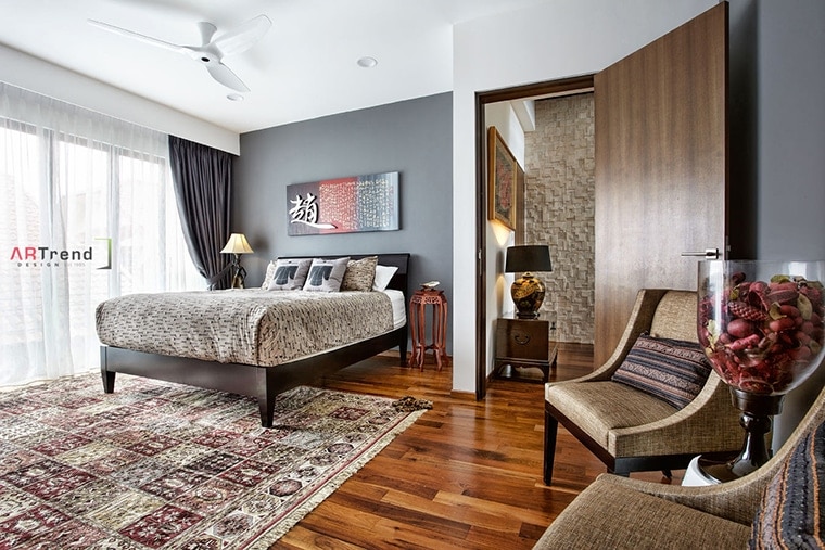
Bedroom
Bedrooms benefit from low-contrast palettes.
Effective bedroom palettes often include:
- Soft greys.
- Muted blues.
- Warm taupe.
- Earthy neutrals.
Avoid high-contrast combinations that overstimulate the space.
Kitchen and Dining
Clean and practical palettes work best here.
Popular combinations:
- White + light wood.
- Grey + black accents.
- Beige + stone textures.
Consistency between cabinets, countertops, and backsplash is more important than bold colour choices.
Right Colour Palette for a Room: Do’s and Don’ts
Do Don’t Test colours in your actual space Choose colours only from online photos Consider lighting first Ignore bulb colour temperature Stick to a controlled palette Mix too many colour families Match colours to function Follow trends blindly
| Do | Don’t |
|---|---|
| Test colours in your actual space | Choose colours only from online photos |
| Consider lighting first | Ignore bulb colour temperature |
| Stick to a controlled palette | Mix too many colour families |
| Match colours to function | Follow trends blindly |
This table reflects issues we repeatedly see during consultations.
Real Observations From Interior Projects
From ARTrend’s internal project reviews, homes that finalised their colour palette before carpentry had:
- Fewer repainting requests.
- Fewer furniture mismatches.
- Higher post-renovation satisfaction.
In contrast, colour decisions made late often led to compromises and additional costs.
Common Colour Palette Mistakes to Avoid
Some of the most frequent issues we see:
- Choosing paint before lighting.
- Matching everything instead of layering tones.
- Using dark colours in poorly lit rooms.
- Ignoring flooring colour influence.
The right colour palette for a room considers all surfaces, not just walls.
Trends vs Timeless Colour Palettes
Trends change fast. Paint is expensive to redo.
Timeless palettes usually include:
- Neutral bases.
- Natural materials.
- Subtle contrast.
- Texture instead of strong colour shifts.
We always recommend anchoring the room in timeless tones, then adding trends through accessories.
How ARTrend Plans the Right Colour Palette for a Room
At ARTrend Interior Design, colour planning is integrated into:
- Space planning.
- Lighting design.
- Material selection.
- Furniture coordination.
Our experience across Residential Services and commercial projects allows us to understand how colours behave in real environments, not just on mood boards.
Conclusion: Choosing the Right Colour Palette for a Room Is a Planning Decision
The right colour palette for a room is not about trends or personal favourites alone. It’s about understanding space, light, function, and daily habits, then translating that into a controlled and thoughtful colour strategy.
At ARTrend Interior Design, we help homeowners and property owners choose colour palettes that last, feel comfortable, and work in real life. If you’re planning a renovation or redesign, start with colour clarity early. It saves time, cost, and regret later.
FAQs (Frequently Asked Questions)
How many colours should I use in one room?
Ideally three. One base, one supporting, one accent.
Does white always make a room bigger?
Not always. Poor lighting can make white feel flat or cold.
Can I mix warm and cool colours?
Yes, but it must be controlled. One should dominate.
Should flooring colour match wall colour?
They should complement, not match exactly.
When should colour be finalised during renovation?
Before carpentry and lighting plans are locked in.