Overview: What Are the Best Colour Palettes for Apartments?
The best colour palettes for apartments are combinations of colours that balance comfort, light, and personality while working within the limits of apartment living. Unlike landed houses, apartments usually come with fixed layouts, limited natural light, and spaces that need to serve more than one function.
Because of that, colour decisions in apartments matter more than most people expect. A shade that looks fine on a sample card can feel heavy once it covers an entire wall. On the other hand, the right palette can make even a modest apartment feel calm, open, and surprisingly personal.
In professional Residential Services, colour planning is often one of the earliest decisions made, because it affects every other design choice that comes after, from flooring to carpentry to lighting
Why Colour Choice Matters More in Apartments Than You Think
Colour affects how a space feels long before furniture is noticed. In apartments, this effect is amplified because rooms are closer together and visual boundaries overlap.
A poorly chosen palette can:
- Make ceilings feel lower
- Shrink already small rooms
- Feel tiring after long periods indoors
This is not just a residential issue. In professional design practice, similar colour principles are applied in workspaces to influence focus and comfort. The way colours define zones and guide movement in an apartment is closely related to how layout and colour are planned in offices. That’s why many designers use insights from commercial planning as reference. You can see this connection clearly in these office layout ideas in Singapore, where colour, spatial flow, and function work together to support daily use.
The takeaway is simple: colour is not decoration. It is part of how space works.
Core Principles Behind the Best Colour Palettes for Apartments
1. Start With Light, Not Colour
Before choosing paint shades, look at:
- Natural light direction
- Window size
- Artificial lighting temperature
Apartments with limited daylight benefit from:
- Warm whites
- Soft neutrals
- Light-reflective finishes
A north-facing unit, for example, usually needs warmer tones to avoid feeling cold.
2. Think in Layers, Not One Colour
Instead of one flat colour everywhere, use layers:
- Base colour (walls)
- Secondary colour (feature walls, cabinetry)
- Accent colour (soft furnishings, art)
This keeps the apartment visually interesting without being overwhelming.
3. Longevity Beats Trends
Trends come and go fast. Neutral foundations last longer and adapt better when furniture or lifestyle changes.
Popular Apartment Colour Palettes That Actually Work
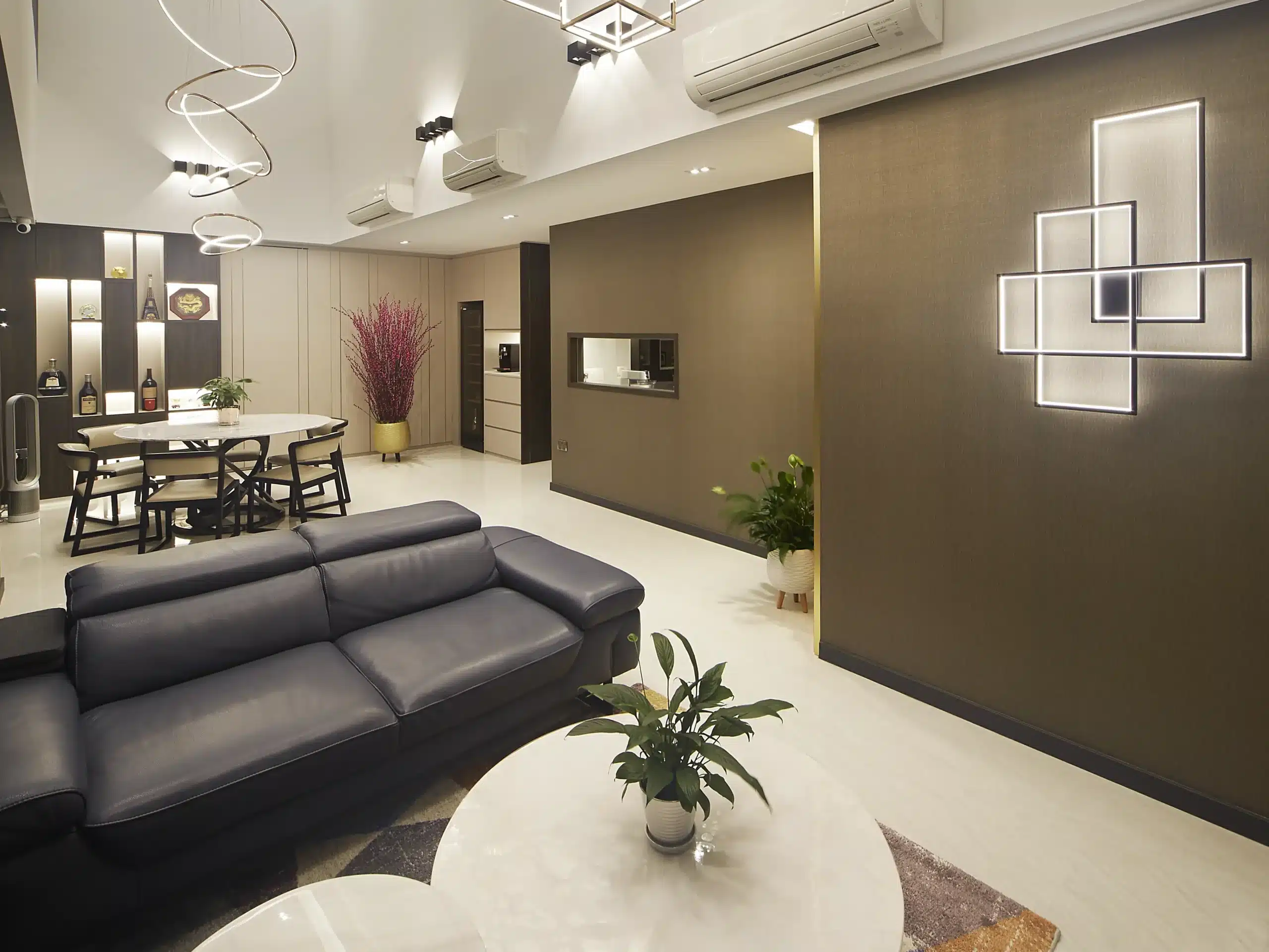
Neutral & Warm Minimalist Palette
This is one of the most requested styles in modern apartments.
Typical colours include:
- Warm white
- Beige
- Soft taupe
- Light oak wood tones
Why it works:
- Makes small apartments feel larger
- Easy to maintain visually
- Flexible for future updates
This palette is especially common in Scandinavian and Japandi interiors.
Modern Grey with Soft Contrast
Grey isn’t boring when done right.
Best combinations:
- Light grey walls
- Charcoal accents
- Warm wood furniture
- Black or bronze fixtures
Caution: Too much cool grey without warmth can feel dull. Balance it with texture.
Earthy Natural Palette
Inspired by nature, this palette is calming and grounded.
Common colours:
- Clay
- Olive green
- Sand
- Warm brown
This works very well for apartments where residents want a slower, more relaxed atmosphere.
Soft Pastel for Compact Apartments
Pastels aren’t just for kids’ rooms.
Examples:
- Muted sage
- Dusty blue
- Blush beige
Used carefully, pastels can:
- Add personality
- Reflect light gently
- Avoid visual heaviness
Room-by-Room Colour Strategy for Apartments
Living Room
Best approach:
- Neutral base
- One subtle accent wall
- Texture through cushions or rugs
Living rooms should feel open and welcoming, not loud.
Bedroom
Bedrooms benefit from calmer tones.
Recommended:
- Soft grey
- Warm beige
- Muted blue or green
Avoid overly bright colours unless used sparingly.
Kitchen
Kitchens don’t need to be white only.
Popular options:
- White + wood
- Grey + warm metal
- Sage green cabinets
Colour here should feel clean but not sterile.
Bathroom
Bathrooms in apartments often lack windows.
Safe choices:
- Light neutral tiles
- Warm off-white walls
- Subtle stone textures
Dark bathrooms can work, but only with good lighting design.
Simple Table: Matching Apartment Size to Colour Palette
Apartment Size Recommended Palette Reason Studio / 1BR Light neutral Maximizes space 2–3 Bedroom Neutral + accent Balanced depth Large units Earthy or darker tones Adds character
Common Mistakes People Make With Apartment Colours
- Choosing paint under store lighting only
- Ignoring how colours change from day to night
- Using too many bold colours in small spaces
- Copying showroom designs without adapting
| Apartment Size | Recommended Palette | Reason |
|---|---|---|
| Studio / 1BR | Light neutral | Maximizes space |
| 2–3 Bedroom | Neutral + accent | Balanced depth |
| Large units | Earthy or darker tones | Adds character |
- Choosing paint under store lighting only
- Ignoring how colours change from day to night
- Using too many bold colours in small spaces
- Copying showroom designs without adapting
These mistakes are common, even among homeowners who do a lot of research.
Pro Tips Before You Finalise Your Colour Palette
- Test paint samples at different times of the day
- Look at colours next to your furniture, not in isolation
- Think long-term, not just first impressions
A colour that feels exciting today should still feel comfortable three years later.
Conclusion: Choosing the Best Colour Palettes for Apartments Starts With the Right Guidance
Choosing the best colour palettes for apartments is not about copying trends or picking what looks nice online. It’s about understanding space, light, and how you actually live inside your home.
At ARTrend Interior Design, colour planning is never treated as an afterthought. Our team considers layout, lighting, lifestyle, and future flexibility when designing apartment interiors. This approach helps homeowners avoid costly repainting and ensures the space feels right from day one.
If you’re planning an apartment renovation or refresh, explore our design insights and real project experience at ARTrend. A well-chosen colour palette doesn’t just change how your apartment looks, it changes how it feels to live in it, every single day.
FAQs (Frequently Asked Questions)
What is the safest colour palette for an apartment?
Neutral palettes with warm undertones are the safest. They age well and suit most layouts.
Are dark colours bad for apartments?
Not always. Dark colours can work as accents or in well-lit rooms, but overuse can shrink space visually.
How many colours should an apartment have?
Usually 3 to 5 colours total, including accents, is more than enough.
Should all rooms have the same colour?
Not necessarily. Keeping a consistent base colour helps, but variation adds interest.
Can colour increase apartment resale value?
Yes. Neutral, modern palettes tend to attract more buyers and renters.